Designing to improve efficiency
Because in enterprise, the user wants to know what to do now
Item views in enterprise apps typically have some form of property card in the upper portion of a screen. They show the name, some actions, and a series of KPIs. And let’s just say they have a tendency to get larger rather than smaller. The downside of these property cards is that they push the content and functionality users need day-after-day lower and lower on the screen. And really, users shouldn’t need to scroll every screen just to perform their job.
Starting point
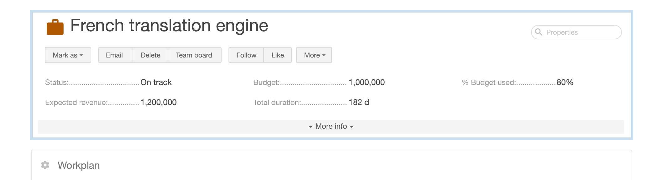
Here’s an example of a typical property or ‘title’ card. It provides key data, but unfortunately, those data aren’t needed every day. The result is that the main content of the screen—the primary work space—is pushed down significantly.
Phase one
The solution in this case was to collapse the card and show only the item name and function buttons. Clicking the info icon would expand the card to show the top level KPIs on demand. This solution reduced the vertical overhead, brought the primary work space up on the screen, and surfaced the next step action buttons.

Phase two
What we increasingly found was that day-to-day users in the enterprise environment really just wanted the name, current status, and simply one action: what needs to be done now. This meant that a detailed property card wasn’t even needed. The result was a clear and useful title space, where the user could easily see status (green for on track) and the next step in the business process (mark the item complete).

The end result is that the top of the screen is clearly readable and useful. And with a vertical space savings of 53%, the core content on the rest of the screen is that much higher in the viewport.